Well, as we all know, Wendy makes some of the most fabulous papers out there, and I love her patterns! I know when I first started scrapping, boldly patterned papers made me a bit nervous. Even now, I sometimes hesitate to go for that more out-there paper, so I've found several ways to use those patterns, but keep them from overwhelming me (or my page).
One of my favorite ways to do this is to blend that patterned paper I love, and so want to use, with a complimentary solid paper. Basically, after that, it's trial and error. Sometimes, I want the whole page to have the pattern, just more subtle, so I layer the papers over top of each other, and then play with the opacity and/or the blending modes. Other times, I might want to limit the pattern to the edges of my paper (giving me a solid with a patterned edge), so for that, I will layer my papers on top of each other, and put a layer mask on the top paper, then just erase away what I don't want--don't forget, if you do that, you can change the opacity and size of your eraser to customize the look even more! (Don't forget, for those of you with PSE or other programs with layer masking, you CAN do this trick using just your eraser, it's just a little more work to fix it if you do something you don't like).
Here's an example of how I faded out the polka dot paper in this layout to cut down on some of the pattern that was overwhelming me on this page (made using Wendy's Cupcake Love mini):

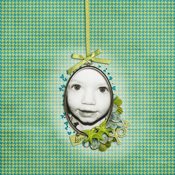
Another way I have used this trick is to create some contrast between a patterned background and a cluster on the page. I did this just recently in a layout I created using Wendy's gorgeous Lucky Me kit. I wanted to use the heart scatter behind my frame, but it didn't show up well enough with the patterned background I used, so I layered the white solid underneath the pattern, and used a layer mask and a brush at reduced opacity to erase some of the top paper, so my clustering etc is more visible---see what I mean?

AND don't forget-you can do this with solids, too! It's how I created this spot of blue on this layout, featuring Wendy's Tropical Paradise bundle.

I hope you are inspired to try this-it's one of my favorite little tricks for making a kit work overtime for me! Thanks for checking in with us today, and I hope you are enjoying your weekend (did you check out Wendy's new releases? If not...scroll down to the next post...you don't want to miss out!).
![WM[squared] Designs](https://blogger.googleusercontent.com/img/b/R29vZ2xl/AVvXsEgxUgJShHT_dFWJhBqkLzc-C8QrhzPi6_DMrf4be21GoKoPI_RAddIx_Q4wvwikLDf5RVfeqGgH4zBvd1oTmNwgQd9EZitpLe0S5GARwLVZMDkx_fIv_oJ1DXBjEDuKnBhHpMsH2-3Czio/s1600/wm2+banner.png)


1 comment:
Great ideas! Thanks for sharing them! :)
Post a Comment